UX/UI Design
Salt Strong

Role
Lead product designer
Duration
8 months
Platform
iOS, Android, Web responsive
Company
Salt Strong Fishing
Redesign of fishing sport community conversion funnel & web brand
While Salt Strong had a devoted fisherman community and thriving business, its digital evolution had not kept up. This resulted in a fragmented brand experience and usability issues across its platforms. I led a comprehensive design refresh, modernizing their visual identity and unifying their site architecture into a streamlined, intuitive ecosystem. I redesigned key areas of the flagship fishing app, the website, conversion funnel, community, and e-commerce store.
I optimized conversion funnels to boost sign-ups, and implemented UX improvements that made onboarding smoother and reduced churn. The result was a more cohesive, high-performing boost in all platforms that resonated with both seasoned anglers and newcomers alike.
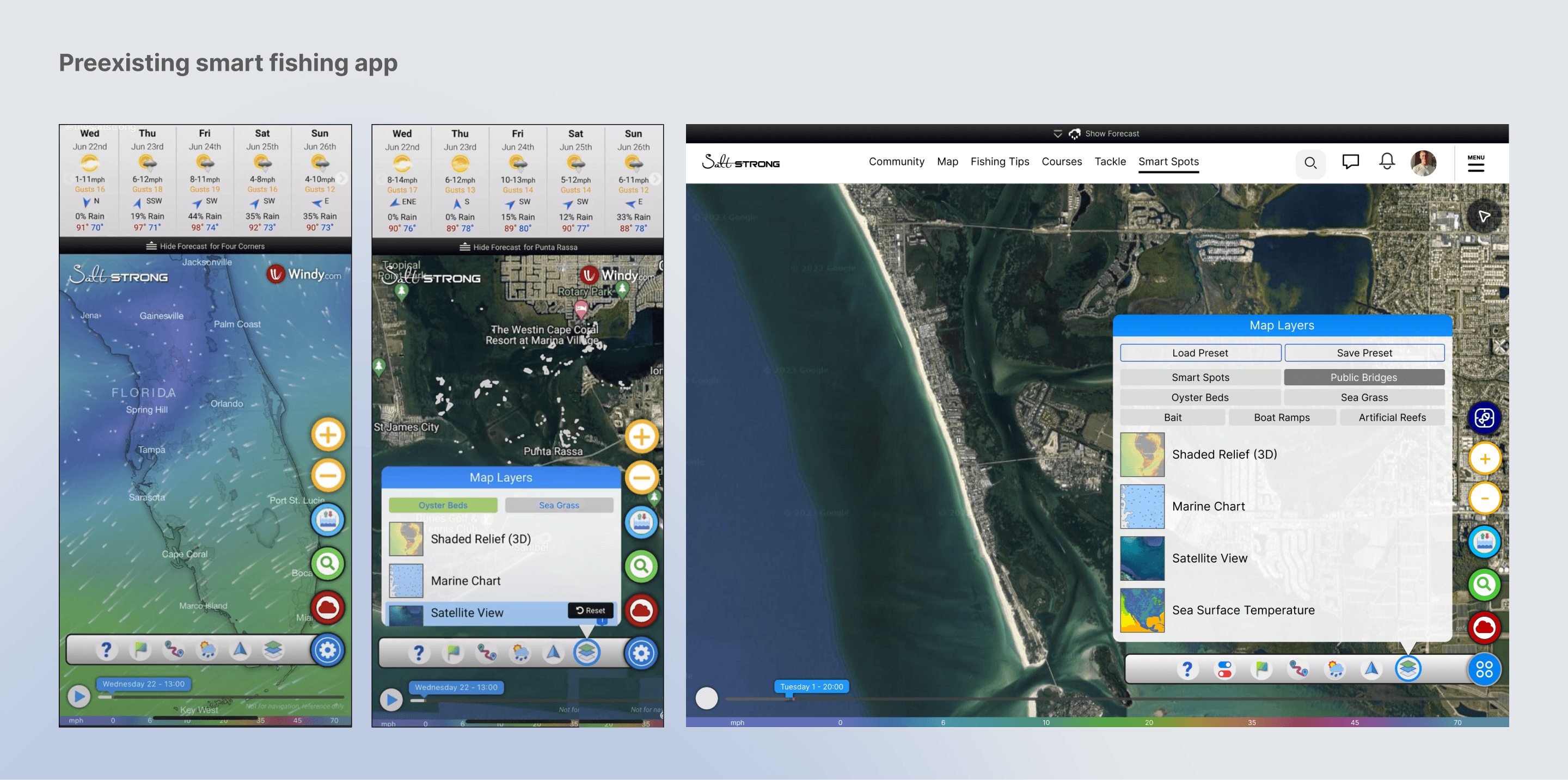
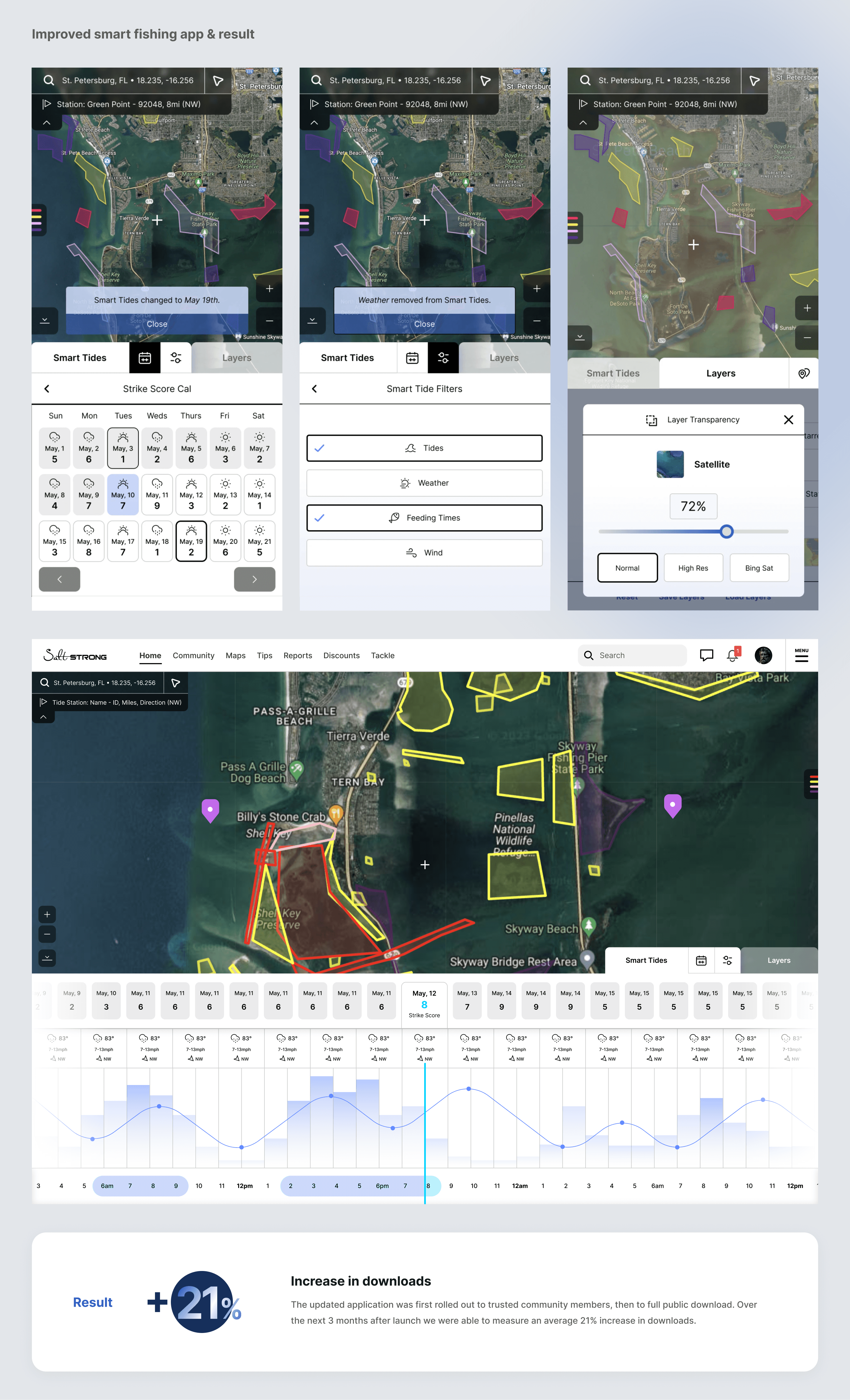
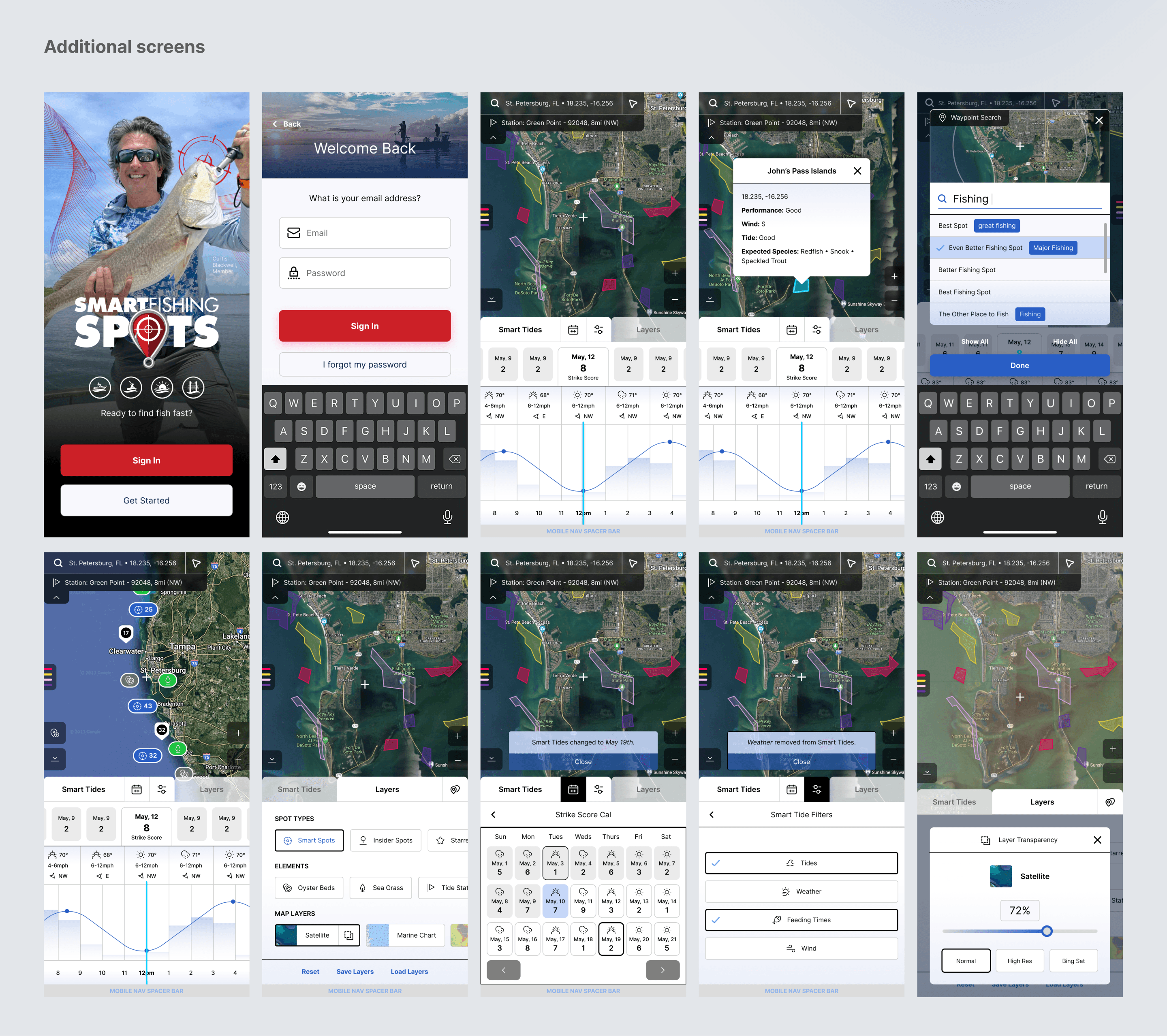
1. Smart Fishing app
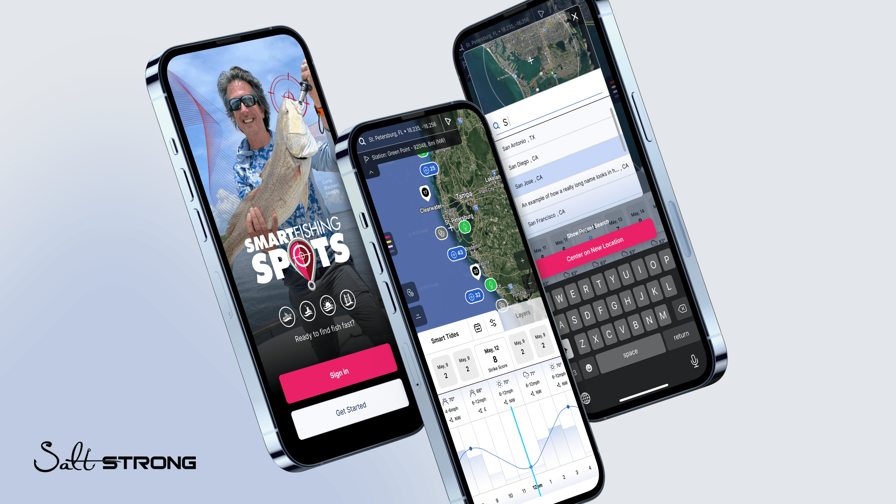
The Smart Fishing Spots app was a unique platform built to let fisherman (anglers) find ideal conditions for finding the best fish. The app combined tides, weather, fishing spot ratings, depth charts, and more.
Before
While the data was powerful the app was extremely hard to use and lacked a lot of accessibility especially in its mobile form.
After
I launched a ground up redesign of the app, emphasizing: modularity, high-contrast easy-to-access intuitive navigation, and full responsive functionality. This resulted in a great boost to NPS and a +21% increase in app downloads.
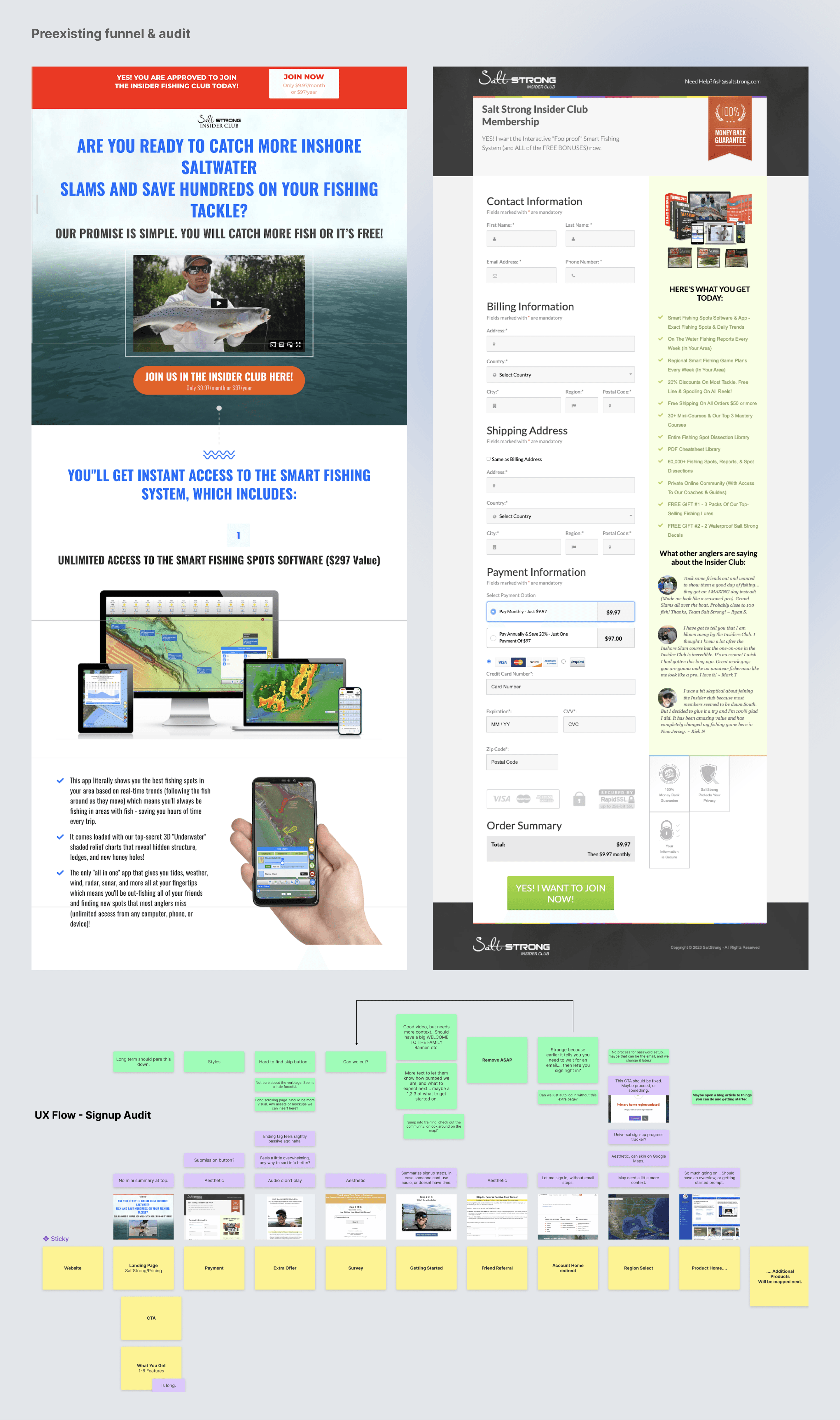
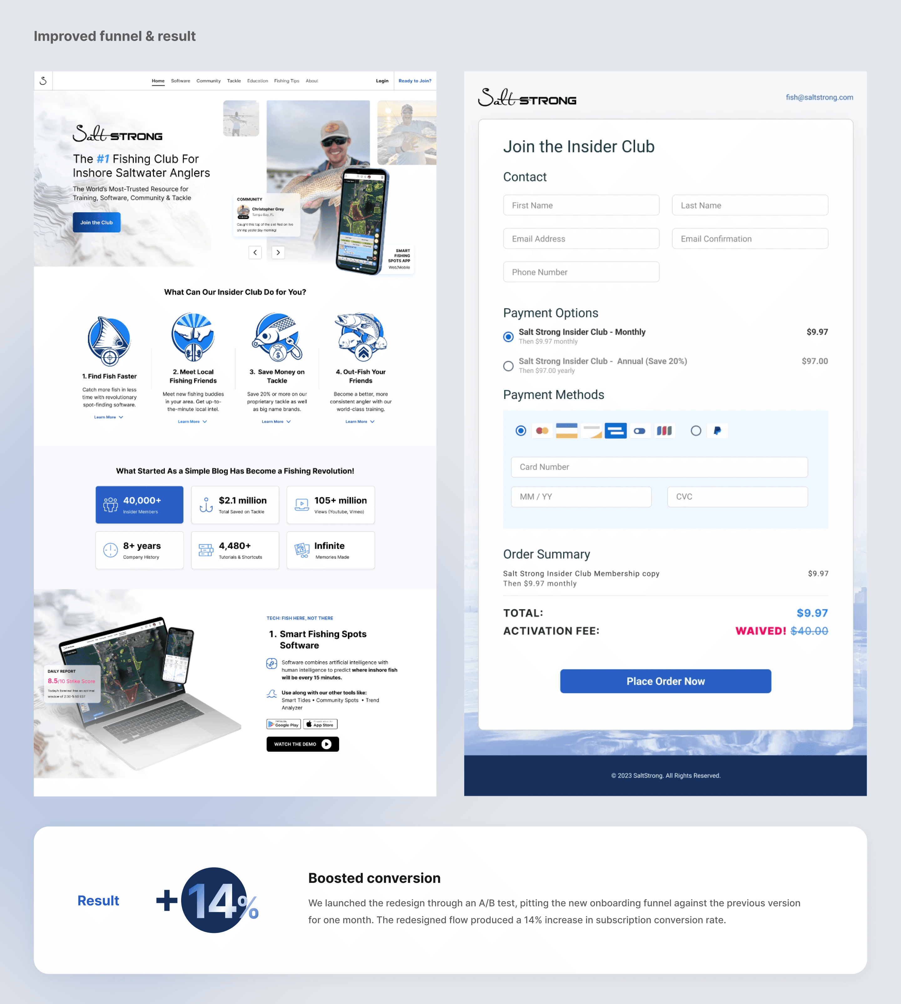
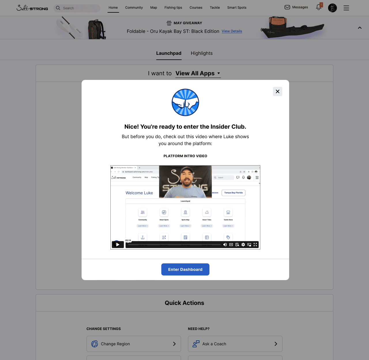
2. Conversion funnel
Salt Strong was seeing a significant drop off in their subscription sign-up flow, particularly between the pricing page, credit card entry, and final confirmation step.
Key friction points I identified:
• The website’s visual design felt outdated and lacked trust signals, which reduced confidence at the moment of payment.
• The signup journey had too many pages, leading to unnecessary cognitive load and abandonment.
• The conversion form was cluttered, not mobile friendly, and created friction at the final step.
After
UX and UI changes I implemented:
• Redesigned the entire marketing site with a modern, credible aesthetic to improve trust and perceived product value.
• Refactored and condensed the signup flow into fewer, more intuitive steps, reducing the amount of effort required to complete the purchase.
• Redesigned the payment form with clearer hierarchy, simplified fields, improved mobile responsiveness, and added supportive microcopy to guide users.
Testing method and results:
We launched the redesign through an A/B test, pitting the new onboarding funnel against the previous version for one month. The redesigned flow produced a 14% increase in subscription conversion rate, a major lift for the company based on their monthly traffic and recurring revenue model.
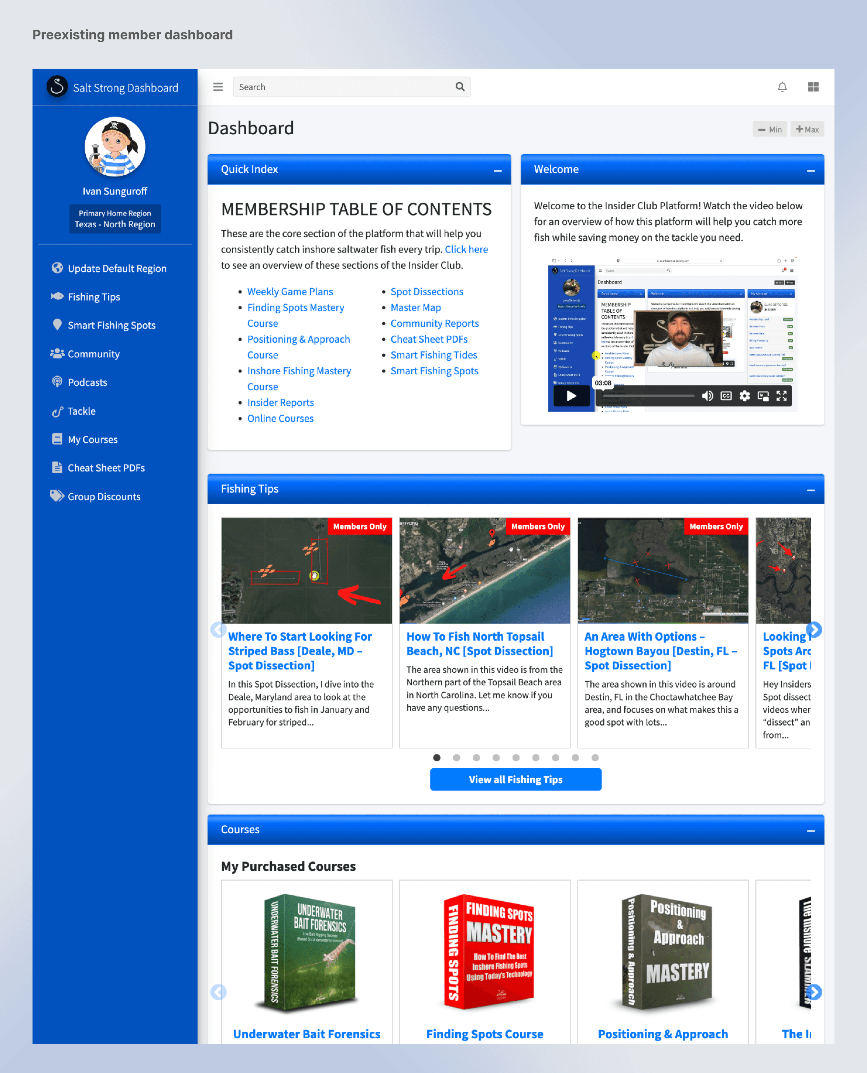
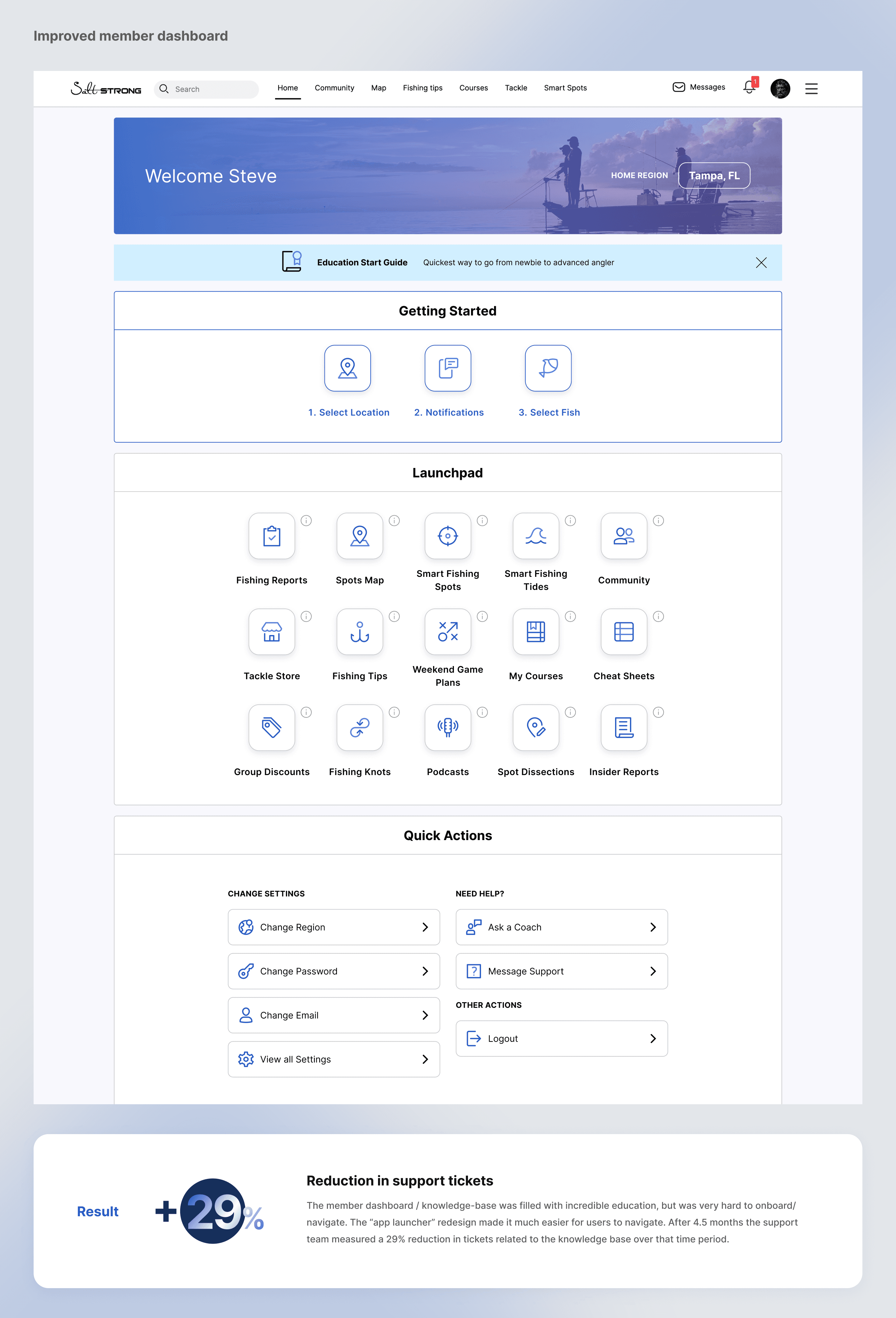
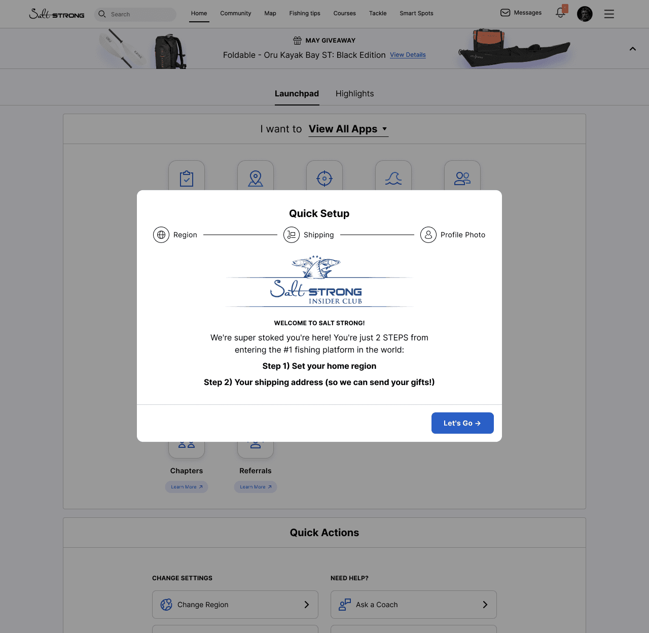
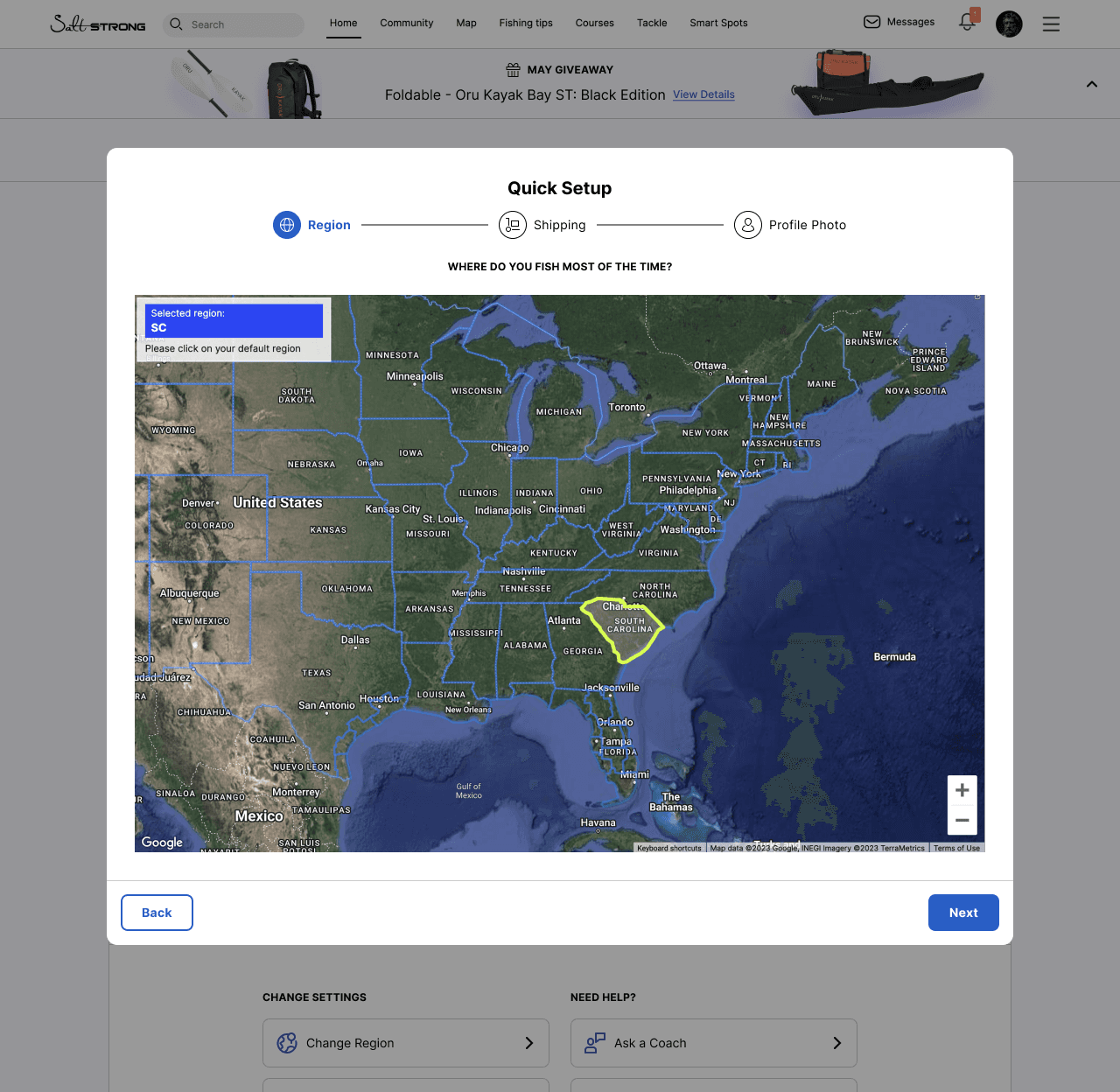
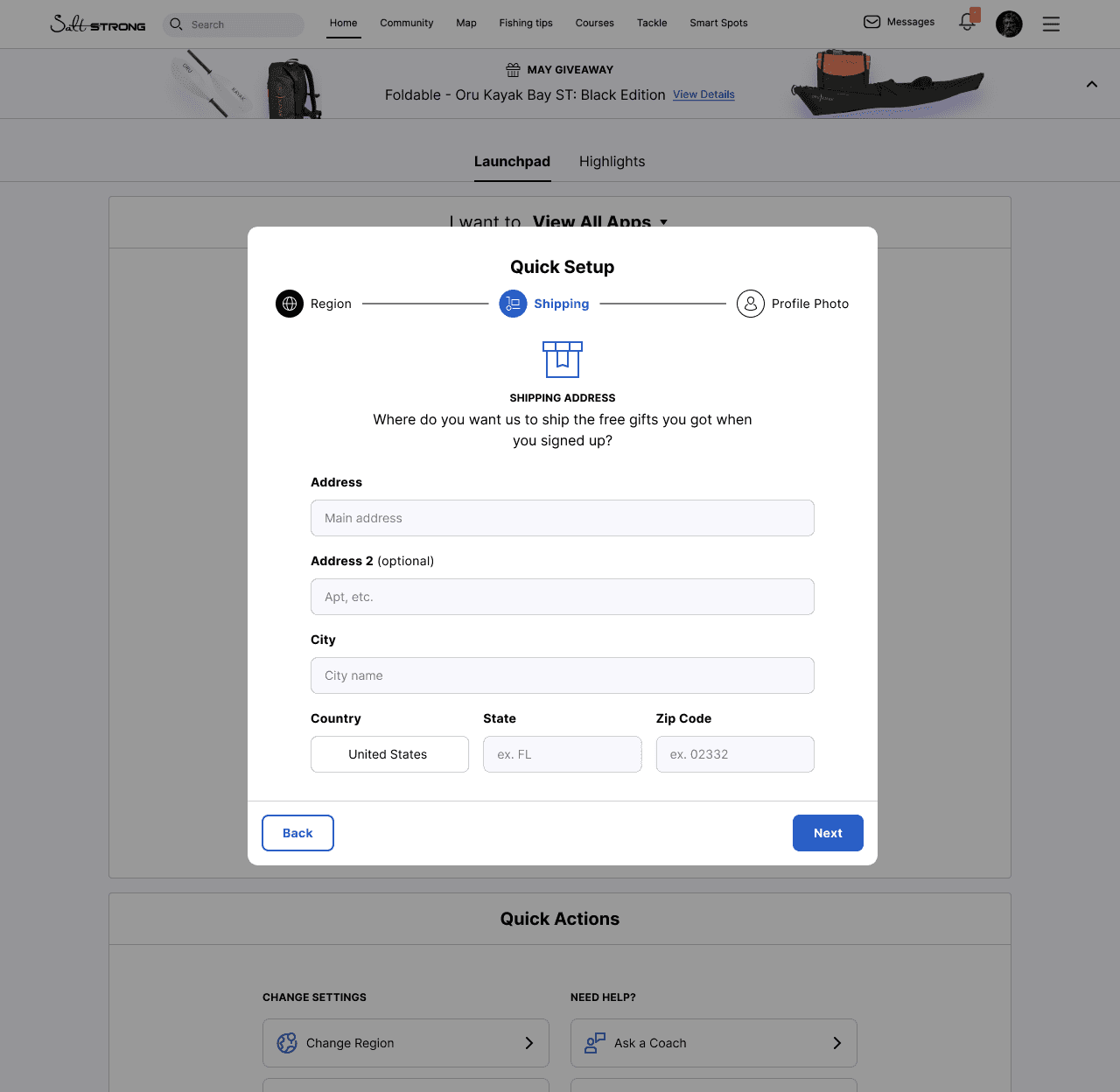
4. Knowledge-base
One of the most powerful legacy features, and the base of their original platform, was their extensive knowledge-base which was an online university for fishing skills and techniques. But the platform felt very antiquated and was very difficult for users to use and navigate.
Before
After
The redesigned "app launch" format and slimmed down signup process had a massive impact on churn and resulted in a measurable reduction in support tickets. It let users get started faster, have questions answered easier, and access all the utilities Salt Strong has to offer right at their finger tips.
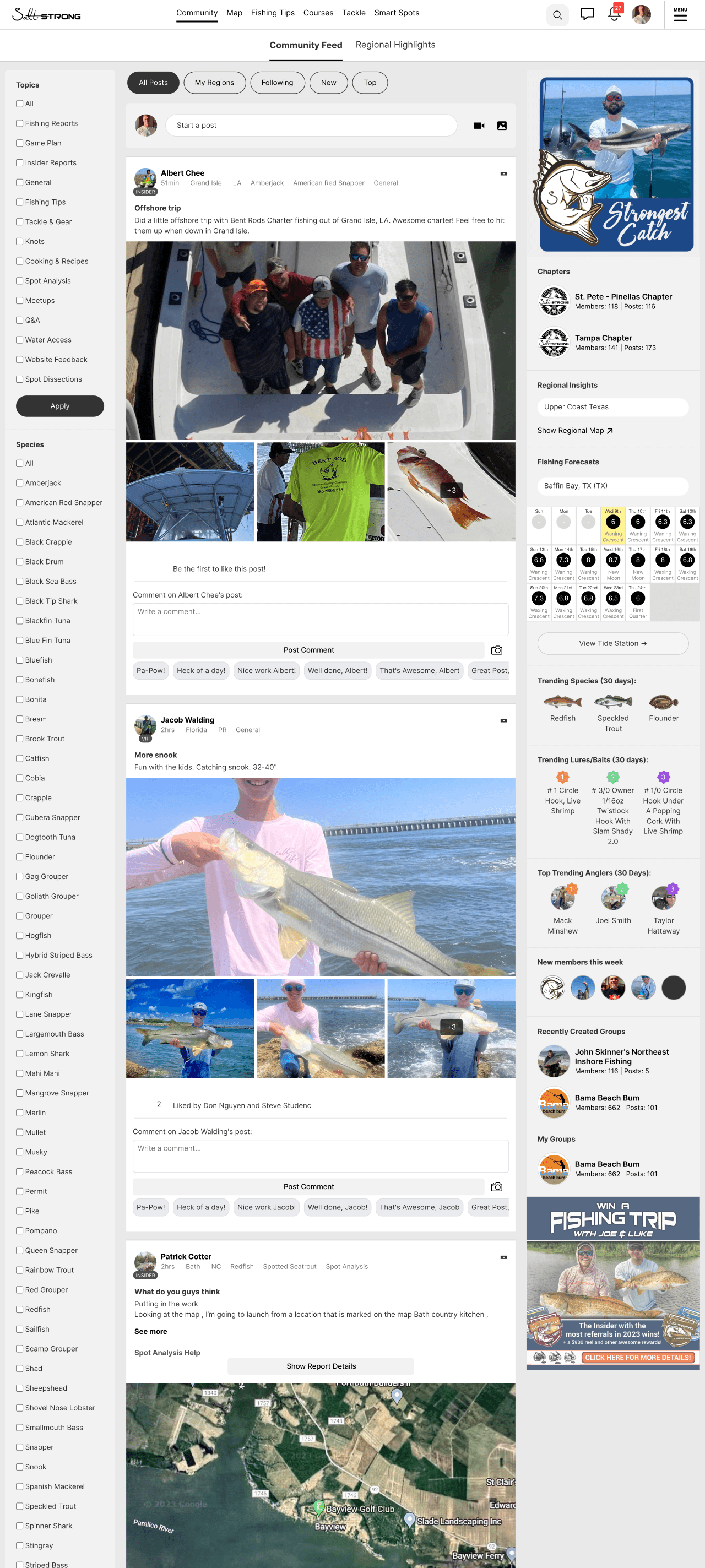
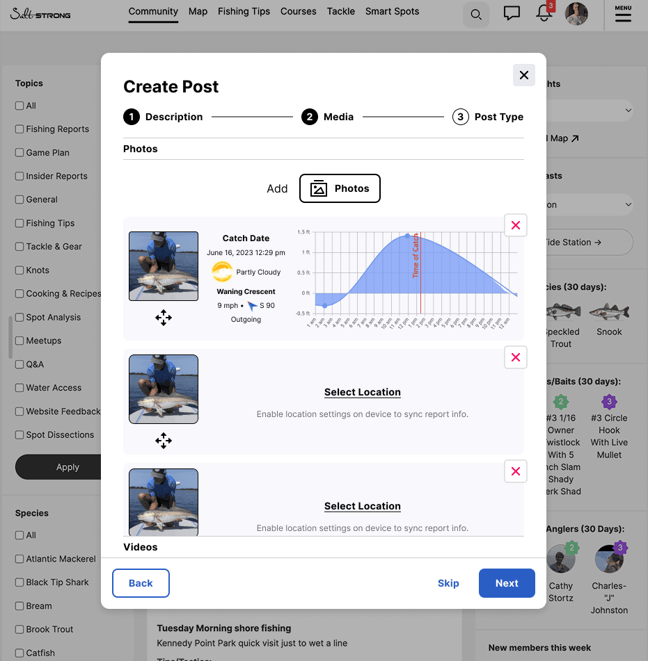
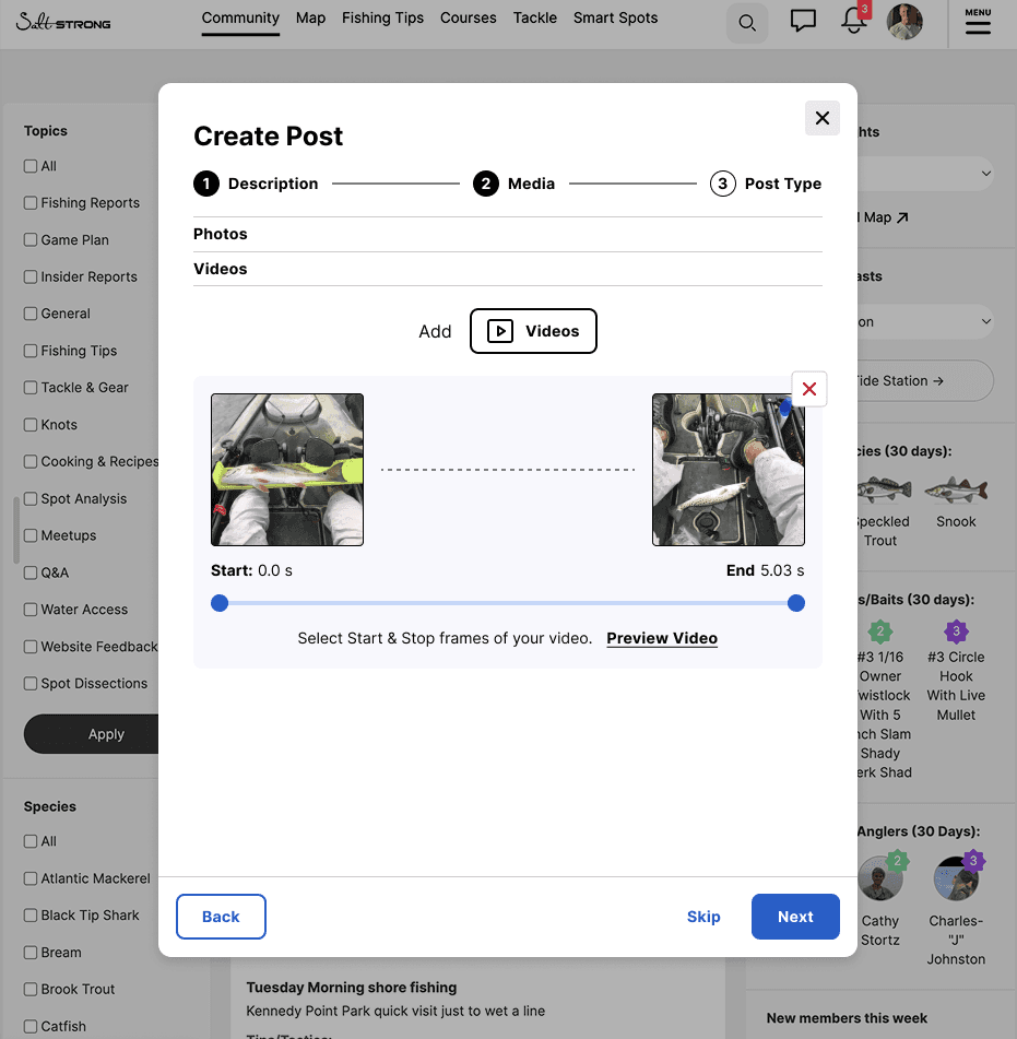
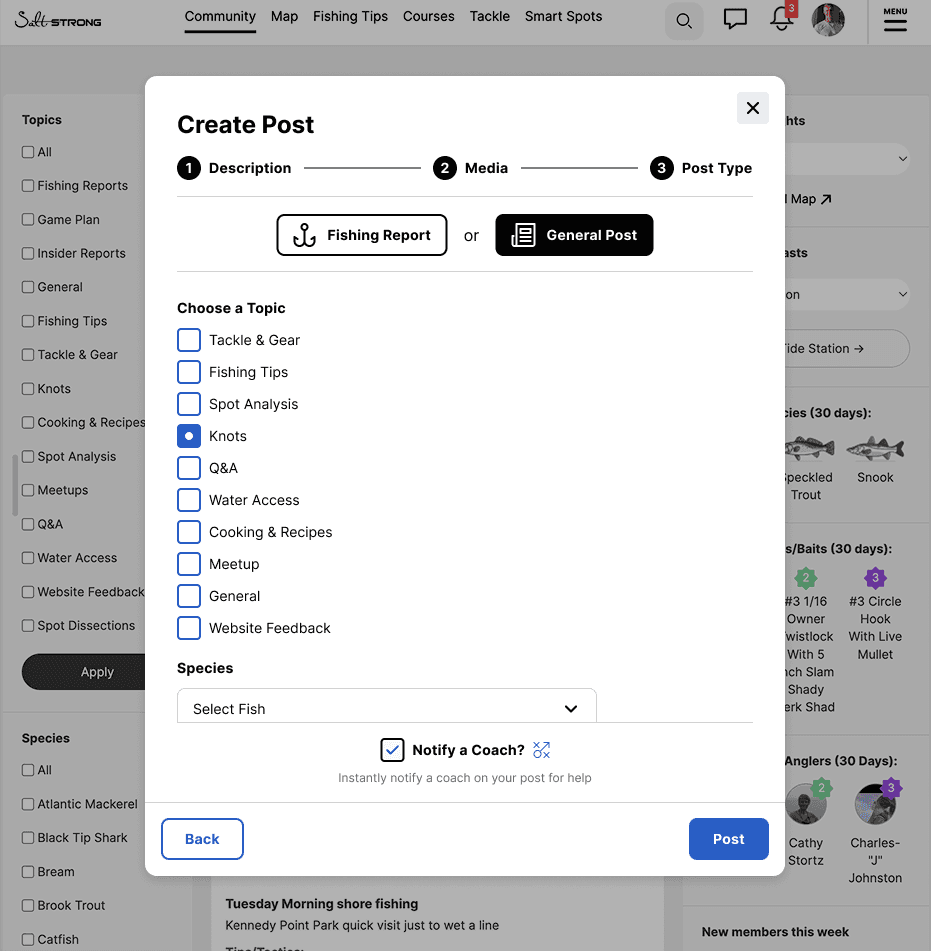
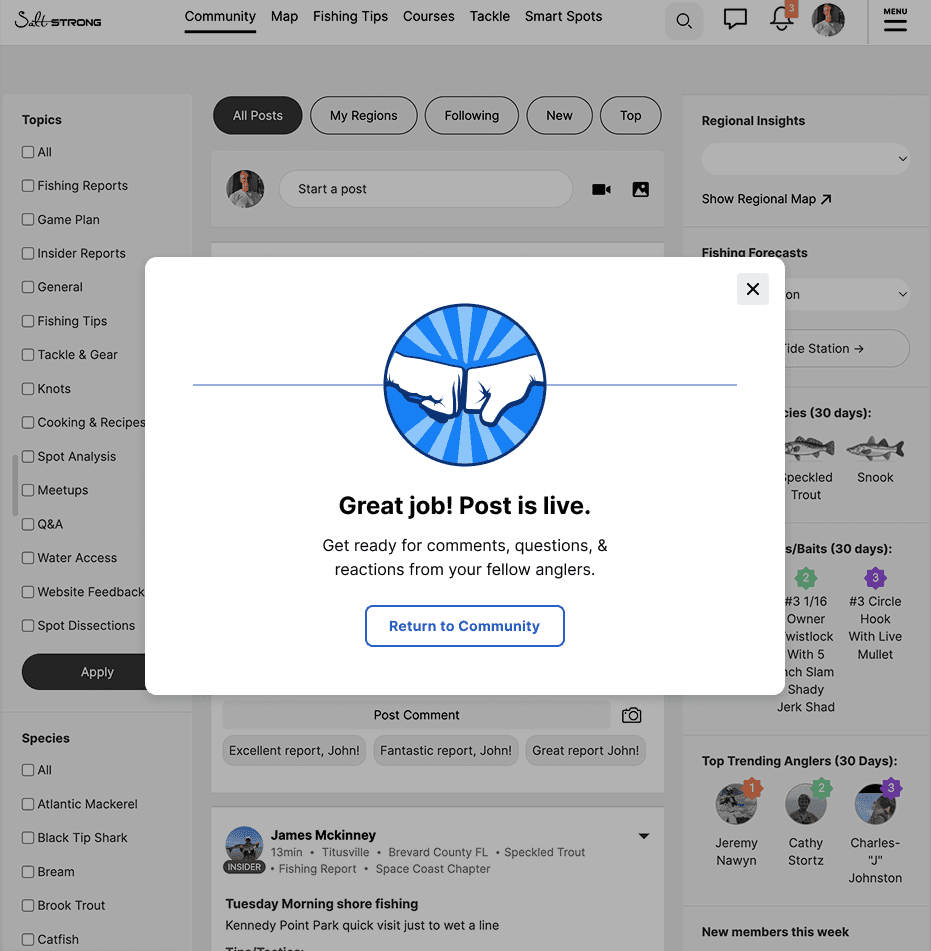
5. Community app
Salt strong also has an impressive built-in social application, a "facebook for fisherman". While the community was strong, it had a lot of problems, was in need of improvements, and implementation of many popularly requested features.
Before
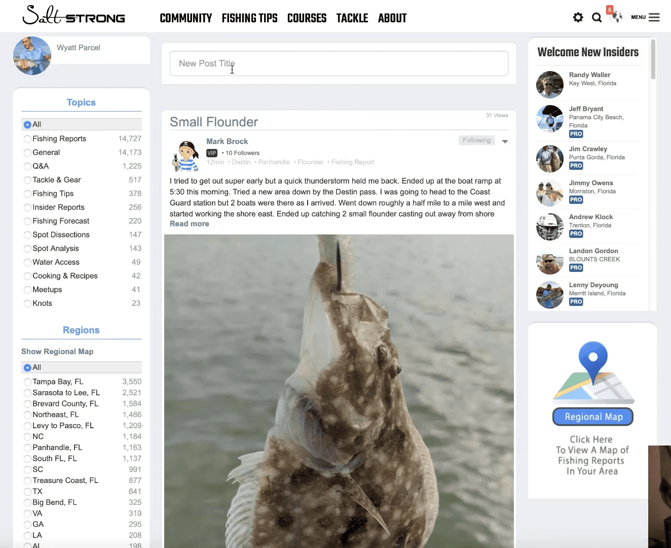
After
I was able to clean up the design of the entire community application and add in many of the new roadmap community driven features, like: regional highlights, rankings / catch competitions, better filtering, improved media posting, and more.